Iterative Design
Portfolio Design
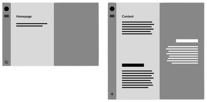
The general structure I envision for my website is as follows: a taskbar on the left and the main content displayed in a split structure, with contrasting colors on each side. I wanted to present my content in an alternating pattern on either side.
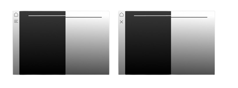
After establishing the structure, I created a visual prototype. I wanted my website to have a modern feel and look, so I chose a black-and-white color palette. To incorporate a taskbar, I added a burger menu that transforms into an "X" when clicked, inspired by a design I saw elsewhere.
I wanted to include paint splashes as eye-catching elements. Additionally, I used shapes with contrasting colors to seamlessly blend the two sides together.
The left side serves as a navigation bar, featuring a home button and a menu button to access other pages. When the burger menu is clicked a pop-up menu appears displaying the content that will be featured on my website.
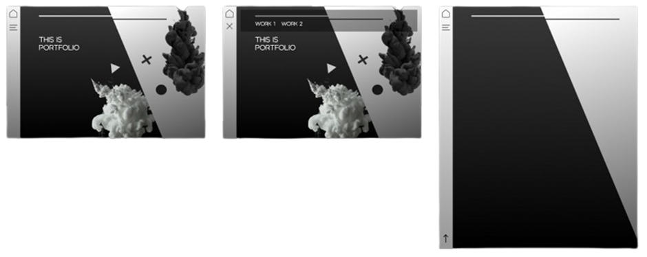
The final website achieved the clean modern look I was aiming for, and I am pleased with its appearance. However, it still feels somewhat empty and could benefit from additional elements not including content.
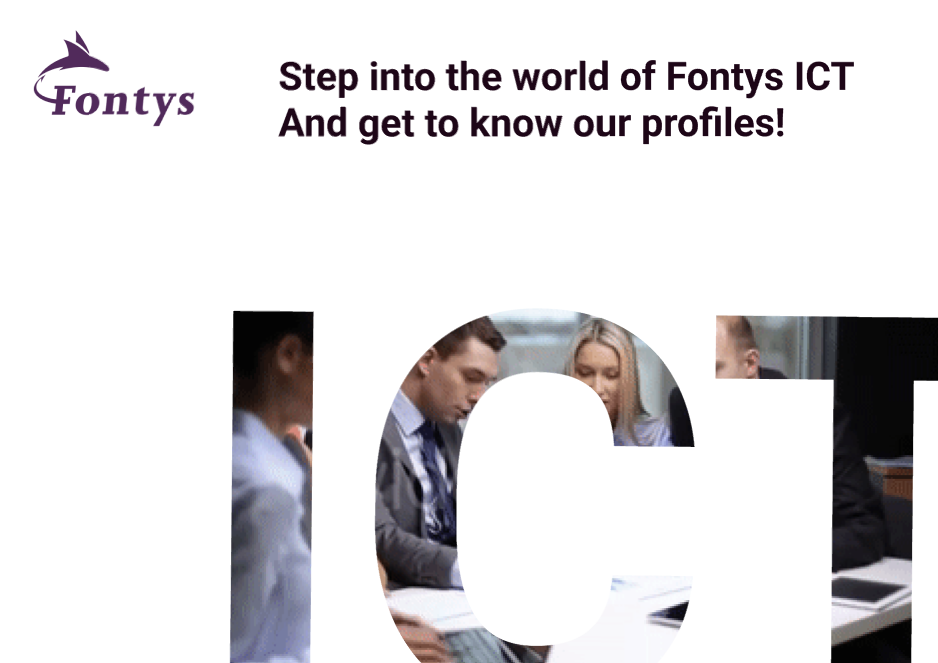
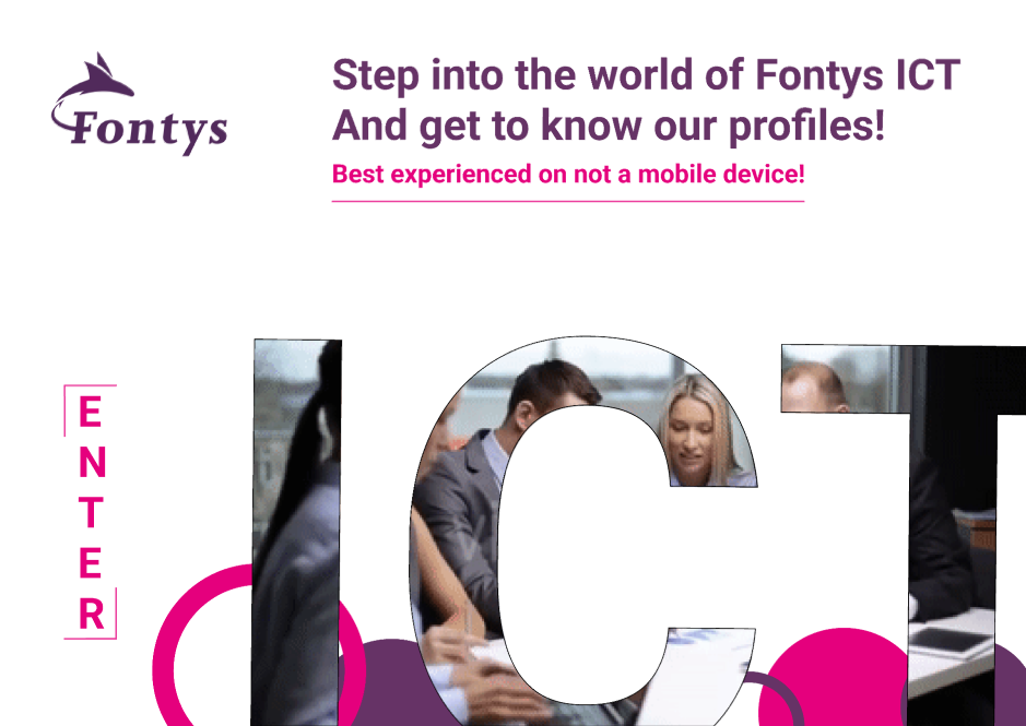
Fontys ICT website design
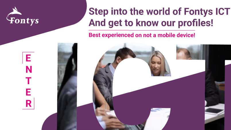
The objective of this project was to redesign the Fontys ICT website to attract new students. My approach was to make the website visually engaging. The inspiration for my design came from a website, which promotes the war movie 1917. The website immerses visitors in the trenches of war with an interesting zoom effect where you "step into the trenches".
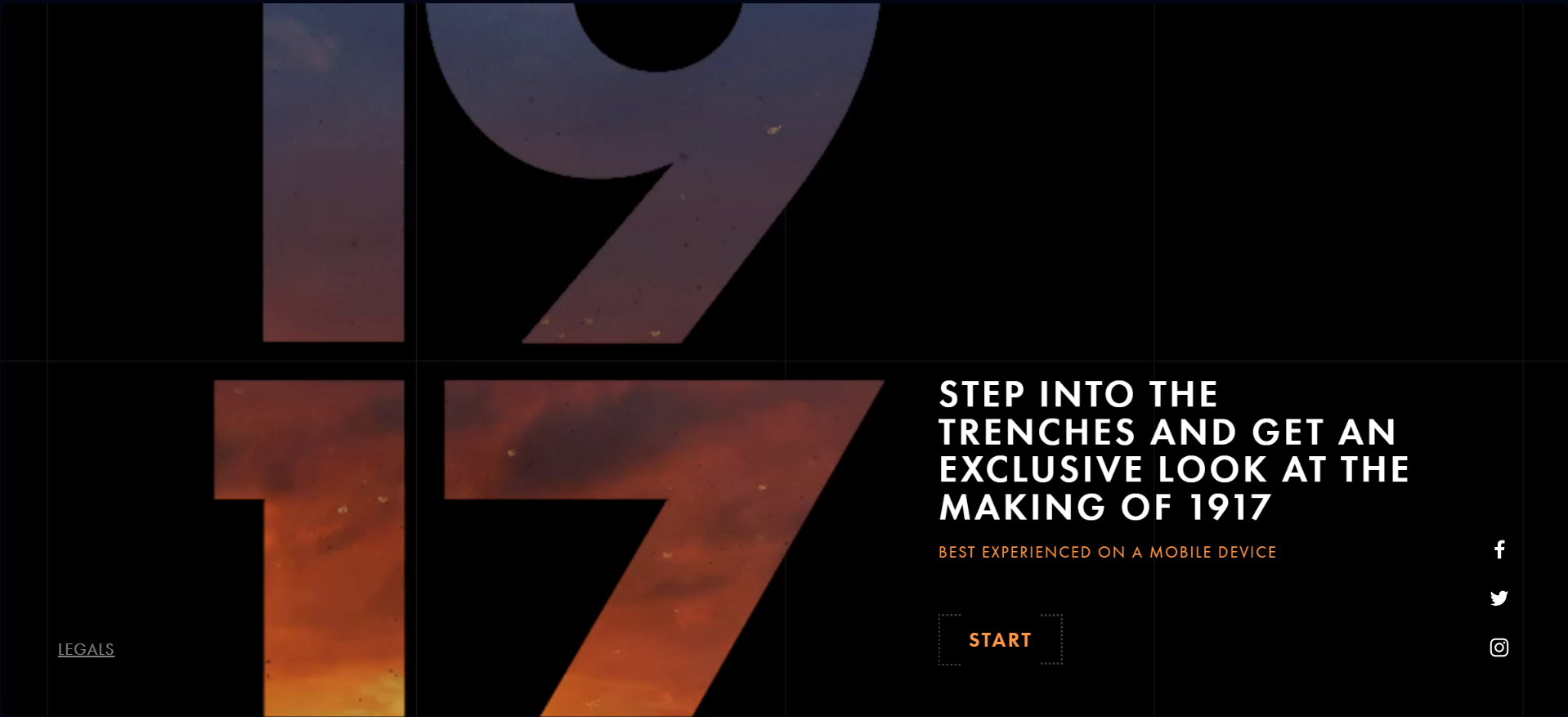
Inspired by this, I wanted to create a similar immersive experience, making it feel like stepping into the world of ICT at Fontys. My idea was to add a video showcasing the inside of Fontys, giving visitors the feeling of being inside the school. I made a template in Figma to simulate the effect seen on the 1917 website, but tailored it to ICT.
After adding the logo and some text, I knew the page needed more elements. Initially, I tried multiple designes using the Fontys brand guide:
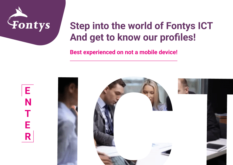
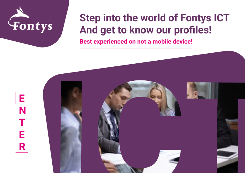
Eventually i was satified with this design where I repositioned the purple element to partially cover the ICT video, creating a nice sense of depth:
In Learning Outcome 2 I explain the process of bringing the design of this website to life in code.
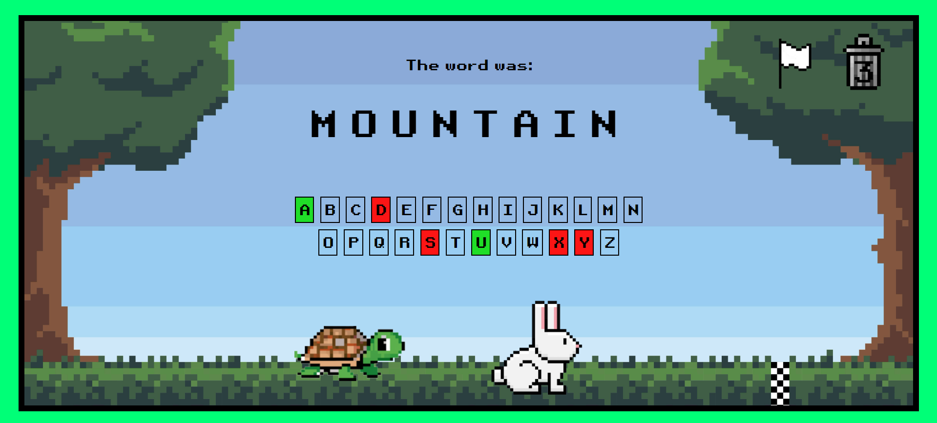
Turtle Vs Rabbit Iteration and Design
For Project X, I aimed to create a game based on my design from the orientation phase at Fontys ICT. Initially, I designed this concept as an assignment to make the classic Hangman game more engaging for children. The game features a race between a turtle and a rabbit to the finish line, reminiscent of beloved storybooks. However, the initial design was somewhat sloppy and needed improvements.
The first step I took was to identify areas for improvement and conduct user testing on my initial design, which looked like this:
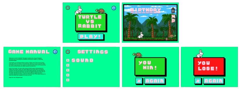
The major issues identified after user testing included the following:
- The background was too busy and didn't fit the animal characters.
- The text on the guide page was too long.
- The user couldn't see how many guess attempts were left.
- The game lacked a surrender button.
- The design needed settings and guide buttons on the lose or win pages.
I addressed these issues in detail in the following document. Fixing these issues led to my second iteration and an improved design:
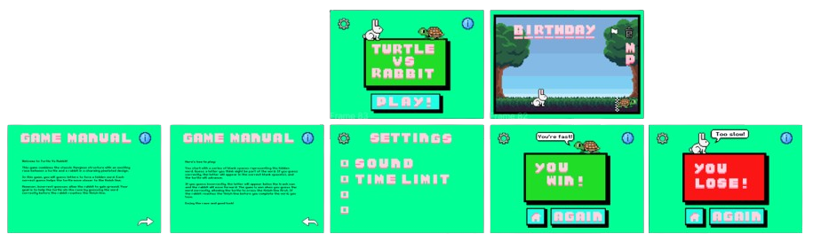
While testing during the development of game, which I discuss in Learning Outcome 2, and with feedback from my coach, I made further changes leading to a third and final iteration. The most significant changes on the main game page included:
- Using a clickable letter panel instead of keyboard input.
- Clicking the surrender icon now displays the correct word before redirecting to the lose page.
- Adding sound effects.
Overall i am very pleased with the design and addressed every point of feedback i got on the it. The game mechanics however could have done with improvement since i didn't finish the settings options due too a lack of time.
Visit the Game